Ever wonder how marketing decisions are made? Using a data-driven approach, this “Science of Marketing” blog series will break down the methodology behind the marketing madness. We’ll examine the strategy that accompanies the UX, design, copywriting, development, and analytics processes, all in order to maximize a company’s impact on its market.
 Of all the steps taken in creating a powerful and effective marketing strategy, many people would think that design is the least likely to use science. However, even though designers do need to have the intangibles of creativity and good intuition, successful design still uses tried-and-true choices for color, shapes, and visual hierarchy that are backed and supported by psychology.
Here are some of the factors that play into an effective and attractive design:
Color
The psychology of color is pretty well known to most people: the color red creates feelings of boldness, power, energy, youth and ambition; blue creates a feeling of calm, security, and trustworthiness; green conveys health, growth, and freshness. When creating a new logo or color scheme, the type of company and the core values they have will greatly play into what colors will show up in their brand.
So even though marketing firms choose swatches and shades that are complementary to each other, look nice, and reflect a brand’s personality, they also know that color is critical to a product’s overall success.
Research shows that about 90% of all product assessments have to do with color – meaning that color is by far the biggest reason a customer purchases a specific product. It also takes only 90 seconds for a customer to form an opinion about a product, and between 62%-90% of that interaction is determined by color alone.

Visual hierarchy and shapes
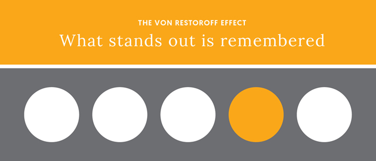
Using certain shapes and visual hierarchy effects help guide customers’ eyes to the important information on a website or a print advertisement. The Von Restoroff effect is the principle that, essentially, the odd one out is what is most remembered. Designers use this to draw attention to what’s most important, and create a focal point in the visual hierarchy of the piece.
“It’s important to create a hierarchy within text and visuals to make it easy for the end user to absorb the information they need,” says Krystine, Brandography’s graphic designer. “Effective design requires a lot of intentionality in making decisions about the size, placement, and relationship between individual elements.”
Like colors, people associate shapes with certain emotions. Squares and triangles signify stability, strength, efficiency, and professionalism. Circles have positive associations with unity, community, and friendship. Vertical lines signify strength, while horizontal lines give the feeling of tranquility and calmness.
Fonts
Fonts play a huge role in determining the personality of a design. Using a traditional, stable serif font for a children’s book cover makes just as much sense as using a fun, casual and crazy decorative font for a legal presentation.
Serif fonts convey traditionalism and professionalism, and are easy on the eye when reading a lengthy amount of text. Sans serif fonts are simple, modern and clean, making them a good choice for digital design. Script and handwritten fonts are very popular right now, and they create a more personal and approachable feel to the pieces they’re used on. Display and decorative fonts are used sparingly; looking back to the Von Resteroff effect, display and decorative fonts can be used to draw the viewer’s attention to important information on a page.
If you’re looking for brand identity design or other branding services that will reflect your company’s personality and resonate with customers, contact Brandography today!


