How to Craft a Memorable Logo
Take a moment to count how many logos are visible around you right now. You’ll likely count the little apple on your computer or the name on your monitor but don’t forget about pop can and coffee cup next to it. What about your clothing? Is there a little guy riding a horse on your shirt or a swoosh on your shoes? And don’t forget to about that happy wiener dog at the top of this blog post!
As you counted the number of logos around you, you likely felt a certain emotion or experienced a memory based on each brand identity represented. We are constantly bombarded by logos representing different companies with different services and different stories that are all trying to influence you into a certain action. Its really amazing the way a green mermaid can convince us to buy coffee without saying a word.
Thousands of books and articles have been written on logo creation and branding strategy, but don’t worry; we won’t bore you with a master class in the elements of design. In this blog, we will look at a few of the higher-level design factors to help you better understand what goes into a great logo.
Color
A logo’s dominant color creates an instant emotion with the viewer before the brand is even understood. Color helps communicate what a company stands for without explicitly stating it. What if McDonald’s golden arches were suddenly black? Might have to rethink that Big Mac. That said, good logos never overuse color. Simple color schemes allow them to keep their appeal and integrity when used across different mediums and applications.
Yellow conveys a sense of energy, freshness, and the joy of being alive.


Green conveys a peaceful trust and a connection with Mother Nature.


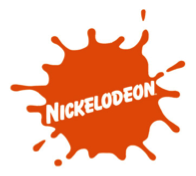
Orange conveys a creative determination and helps stimulates mental activity.


Font
Look at the logos around you once more. I can all but guarantee none of them use the same typeface. Similar to colors, the font used in a logo says a lot about a brand. Is it a luxury company? Does it market towards kids? Certain fonts can even communicate a brand’s specific industry. Here are three examples of fonts that made a logo iconic:
Simplicity
This may be the most important yet most difficult part of creating a brand. It’s far too easy to complicate a logo by trying to incorporate everything a business stands for. Many of the world’s best logos are also the simplest. Keep in mind that even though these logos do embrace simplistic design, it is the reputation of the company they represent that truly makes them iconic.
Great logos don’t just happen overnight. The design and branding process can take months if not years. Remember, your brand identity is what will represent your business for years to come so it’s important to take time to weigh the pros and cons of each option before making a decision and moving forward.
Interested in Learning More About Logos?
The graphic designers and marketing consultants at Brandography are ready to help you develop a logo you can be proud of. Check out our Minneapolis marketing firm’s design portfolio to see how we’ve helped companies of all sizes find their brand identity with logo creation and expert branding services. Contact us today and let’s talk logos!


